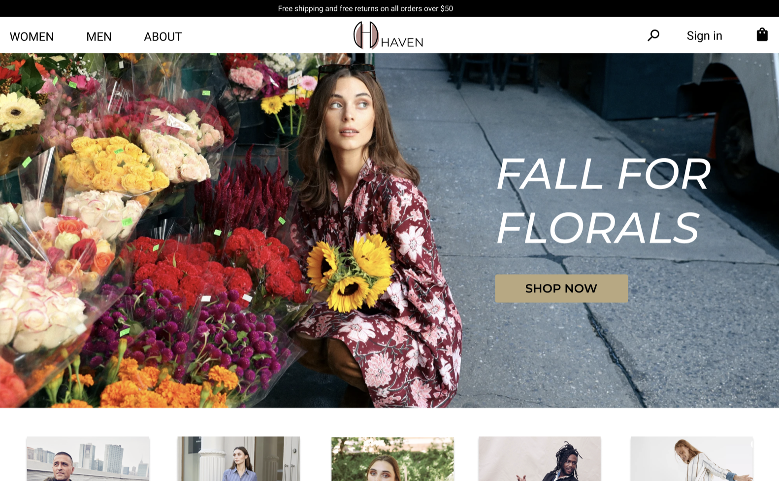
HAVEN—a sustainable fashion brand and e-commerce site design.

-
Client / Timeline
HAVEN / 4 weeks
-
My Role
UX/UI Product and Brand Designer
-
Tools Used
Figma, Whimsical, Illustrator, Typeform
-
Background
HAVEN is a sustainable fashion company looking to improve the aesthetics and usability of its e-commerce website. In addition, they would like to feature their sustainability practices newsletter sign-up to increase customer education and acquisition.
-
Challenge
HAVEN would like a complete redesign of its brand and e-commerce website. This will involve market research, user research, and UI brand work to come up with a product design that captures the aesthetic and functionality that HAVEN is looking to attain.
-
Goals
This project aims to gather information via competitive analysis and user research. The data will be used to create a brand identity and design an e-commerce site based on highlighting information in an easy-to-use format.
1. Empathize
Goals
Discover which services and information should be priorities to include on the site.
Explore demographics of the customer group.
Inquire about website and brand needs and wants.
Methodologies
Competitive Analysis
Market Trends
User Interviews
User Persona
Findings
Convenience is the number one reason for shopping online.
Product information is vital.
Free shipping and returns are very important.
Participants prefer to shop with ‘green‘ companies.
Competitive Analysis shows customer expectations
The fashion e-commerce industry is worth $110 billion today and is projected to grow to $153 billion by 2024. The sustainable fashion segment is expected to grow from $6.35 billion to $8.25 billion by 2023.
With so many facets to sustainable fashion, ecological integrity as well as social justice of garment production, it can be challenging to define what makes a brand sustainable. Marketing, therefore, plays a vital role in communicating a brand’s sustainable practices with consumers.
User Interviews
The customers I interviewed ranged in age from 27 - 56. All customers had similar goals, however, they had some different priorities in gathering information for those goals.
Creating a user persona based on research findings
The research showed that the HAVEN user is a busy professional who prefers to shop online for convenience. She buys clothing for her family as well as herself and occasionally uses a clothing subscription service. She has come to expect free returns and will not shop at a company that does not offer this feature.
2. Ideation
Mind Map
Since fashion websites have so many product offerings, it was crucial to design an effective and intuitive information architecture where users can search trends, explore categories, and ultimately find their desired products.
User Task Flow
Mind Map
After gathering research and putting together a list of which site features users expect, I created a site structure tree to represent the information visually. This helps to facilitate how all the pages and information relate to each other and flow together on the site.
User Task Flow
Based on the Mind Map, I put together a task flow to take the user from the home page through order confirmation.
3. Interaction Design
Cart Sort
Wireframe Sketches
Low-Fidelity Wireframes
With market research conducted and user survey data gathered, I drew wireframe sketches focused on highlighting the information important to the user. After several sketch iterations, I created low-fidelity wireframes based on the strongest layout.
4. Design & Branding
Style Guide
Logo, icon/wordmark, typography, color palette, and button style
High Fidelity Wireframes
Style Guide
With sustainable fashion as the headliner for this e-commerce site, I wanted the imagery and color palette to reflect a natural, earth-based aesthetic. The curved portions of the logo were chosen to represent circular fashion, while the color palette reflects items found in nature with a sophisticated feel.
5. User testing and Iteration
User testing based on the initial high-fidelity wireframes showed that some improvements could be made to help delineate related features on the site and make the page more user-friendly. The bread crumb at the top of the product listing page was not easy to follow. Instead of a thicker line around the circle reflecting the current page, I added a different fill color for easier visual identification. The categories at the top of the listing page got a little lost in the white background. To fix this, I added a color block behind the categories to help define and separate them from the rest of the products on the page.
Version 1 of Product Listing Page
Version 2 of Product Listing Page


