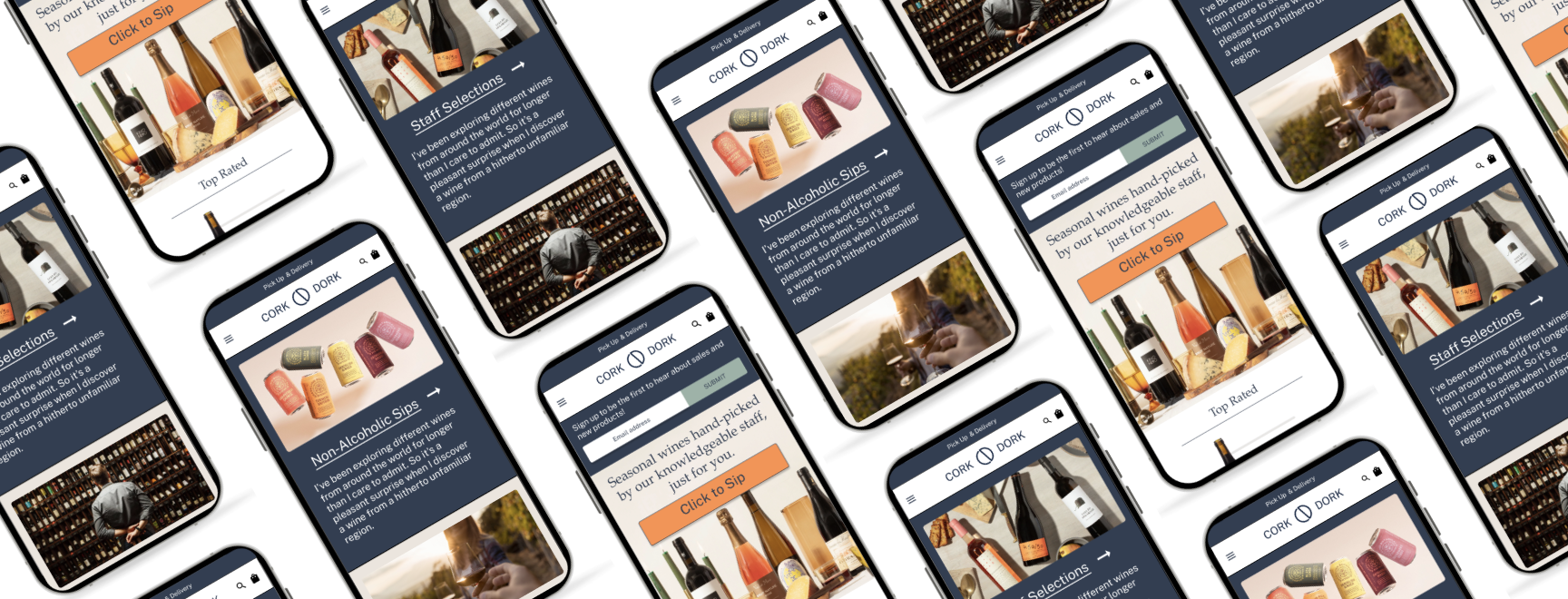
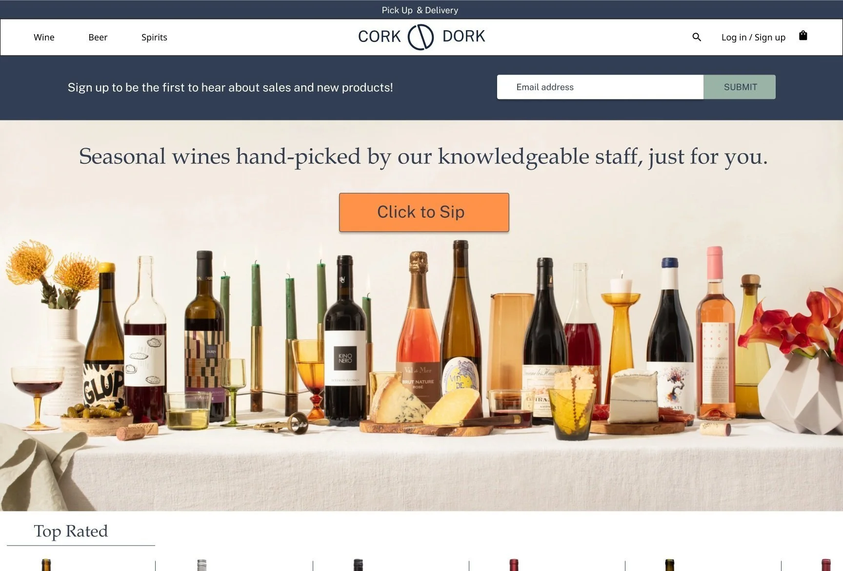
Cork Dork—a website and brand redesign focused on e-commerce and customer engagement.

-
Client / Timeline
Cork Dork, a wine shop / 4 weeks
-
My Role
UX/UI Designer, Brand Designer
-
Tools Used
Figma, Whimsical, Illustrator, Typeform
-
Background
Cork Dork is a local neighborhood wine shop that focuses on unique, quality offerings and educational classes. Cork Dork has struggled to adapt to the changing retail and e-commerce environment and is seeking a brand and website rebuild to continue to serve and exceed customer expectations.
-
Challenge
The covid pandemic has changed the way Cork Dork does business. To adapt, they would like to build a responsive e-commerce website in addition to a brand redesign. The brand redesign should entice potential customers, and the responsive website should be educational and easy to navigate.
-
Goals
Perform market analysis and user research to gain an understanding of the wine/liquor industry standards and Cork Dork customer needs and expectations. Allow user research and competitive analysis to inform design decisions. Conduct user testing and make design iterations based on user feedback.
1. Empathize
Goals
Discover which services and information should be priorities to include on the site.
Explore demographics of the customer group.
Inquire about website and brand needs and wants.
Methodologies
Competitive Analysis/Market Trends
Market Trends
User Survey
Findings
The average customer age group is 25 - 65 years old, middle to upper middle income, and Minneapolis based.
The majority of customers are women (64% v. 36% men) shopping for themselves or family events.
Customers have found Cork Dork through their networks, NextDoor, Facebook, or word-of-mouth.
Competitive Analysis shows customer expectations
Market Trends give us a baseline for industry e-commerce standards. For the wine/liquor industry, customers expect an easy to navigate site with a wide variety of products, customer and staff ratings/reviews, as well as a variety of options for delivery and pick up. For many Cork Dork customers, there was a learning curve for navigating the digital wine shopping experience as it was new for most of them since the onset of the pandemic.
User survey shows most customers shopping mobile
Although most users preferred to shop for wine in person before the pandemic, that has all changed, and the majority now shop online. Almost all online shoppers prefer to use their mobile device versus desktop. This aligns with industry trends towards mobile-first shopping and highlights the need for a responsive website.
Creating a user persona based on research findings
The research I conducted showed that the Cork Dork user is female and a busy professional who is trying to adjust to life post-pandemic. She is motivated by convenience and a drive to support her community.
“I shop more online now for sure, but I miss the advice that I get from the knowledgable people in the store!” - Gwen
2. Ideation
Mind Map
User Task Flow
Mind Map
After gathering research and putting together a list of which site features users expect, I created a site structure tree to represent the information visually. This helps to facilitate how all the pages and information relate to each other and flow together on the site.
User Task Flow
Based on the Mind Map, I put together a task flow to take the user from the home page through to check out.
3. Interaction Design
Wireframe Sketches
Low-Fidelity Wireframes
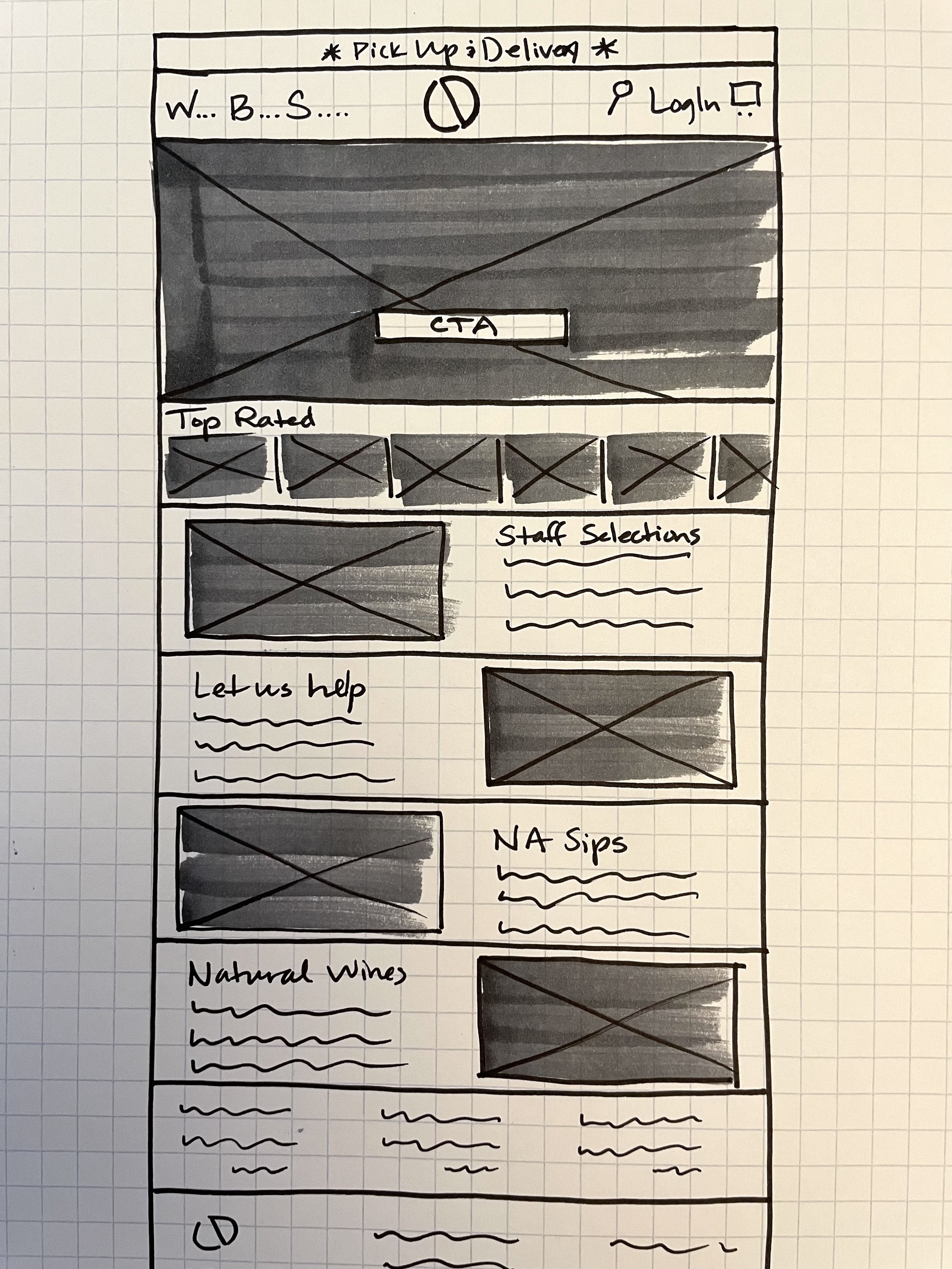
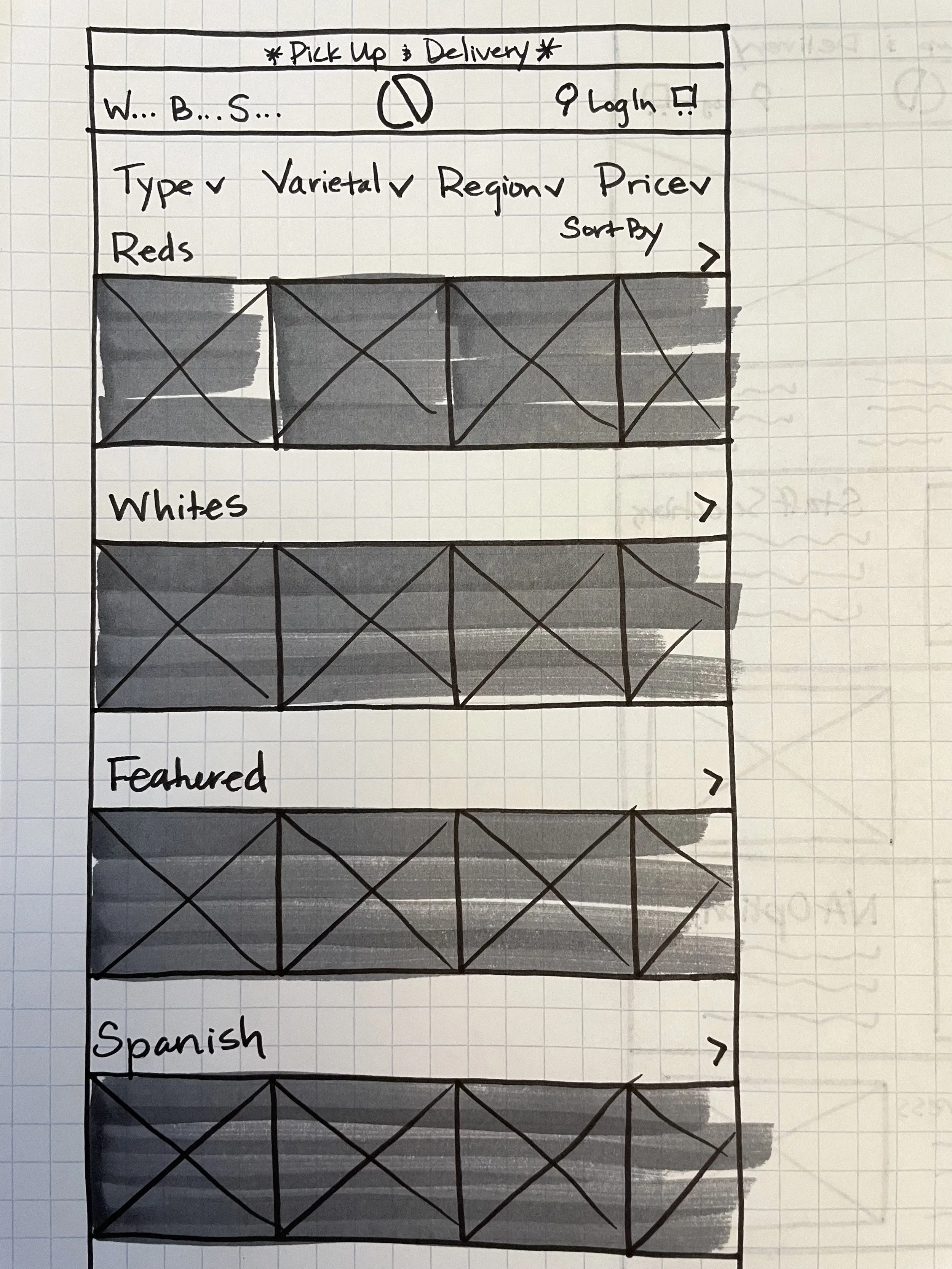
With market research conducted and user survey data gathered, I drew wireframe sketches focused on highlighting the information important to the user. After several sketch iterations, I created low-fidelity wireframes based on the strongest layout.
4. Design & Branding
Style Guide
Logo, icon/wordmark, typography, color palette, and button style
HIgh Fidelity Wireframes
Style Guide
The impetus for the style guide was inspirational imagery supplied by Cork Dork as a jumping-off point. The color palette was a natural next step based on the colors in the images. The typography was chosen to inspire confidence in tone with a modern aesthetic. And lastly, the logo was inspired by the circular shape of the top of a cork while incorporating the monogram for Cork Dork in a clean, easily recognizable form.
5. User testing and Iteration
I conducted user testing based on the initial high-fidelity wireframes and gathered feedback to make improvements based on the findings. The rows of product carousels on the product listing page created a busy feel that overwhelmed the customer with too many options. I solved this by breaking up the carousels and adding content blocks to feature wine classes and staff selections. The outlines around each product on the listing page also gave it a dated feel. I solved this by eliminating the boxes and replacing them with a dividing line which feels less constraining and more modern.
Version 1 of Product Listing Page
Version 2 of Product Listing Page


