CLARE—an augmented reality feature addition to a mobile site.

-
Client / Timeline
CLARE, an interior paint site / 4 weeks
-
My Role
UX / UI Designer
-
Tools Used
Figma, Whimsical, Illustrator, Typeform
-
Background
CLARE is an e-commerce paint store that focuses on making it easy to shop for modern paint colors online. CLARE offers paint samples in a sticker format, a collection of designer-curated colors, and an online style quiz that makes choosing a paint color simple and easy. CLARE believes paint shopping shouldn’t be a hassle.
-
Challenge
The home remodeling business significantly increased with the onset of the covid pandemic. As a result, CLARE would like to expand its customer acquisition in relation to industry growth and believes that adding an augmented reality feature to its mobile site would help to achieve this goal by assisting in the paint selection process.
-
Goals
The goals of this project were to perform market analysis and user research to gain an understanding of industry standards and CLARE customer needs and expectations. Next, allow the user research and competitive analysis to inform UX/UI design decisions, and finally to conduct user testing and make design iterations based on user feedback.
1. Empathize
Goals
Explore demographics of the customer group
Research user motivations and expectations
Gather industry UI trends for AR features
Methodologies
Competitive Analysis
Market Trends
User Survey
User Persona
Findings
The average customer age group is 41 - 50 years old, middle to upper-middle income, and homeowners.
The majority of users gain paint color inspiration from tv, social media, and their social networks.
The ability to virtually view paint colors in a room would significantly improve user purchase confidence.
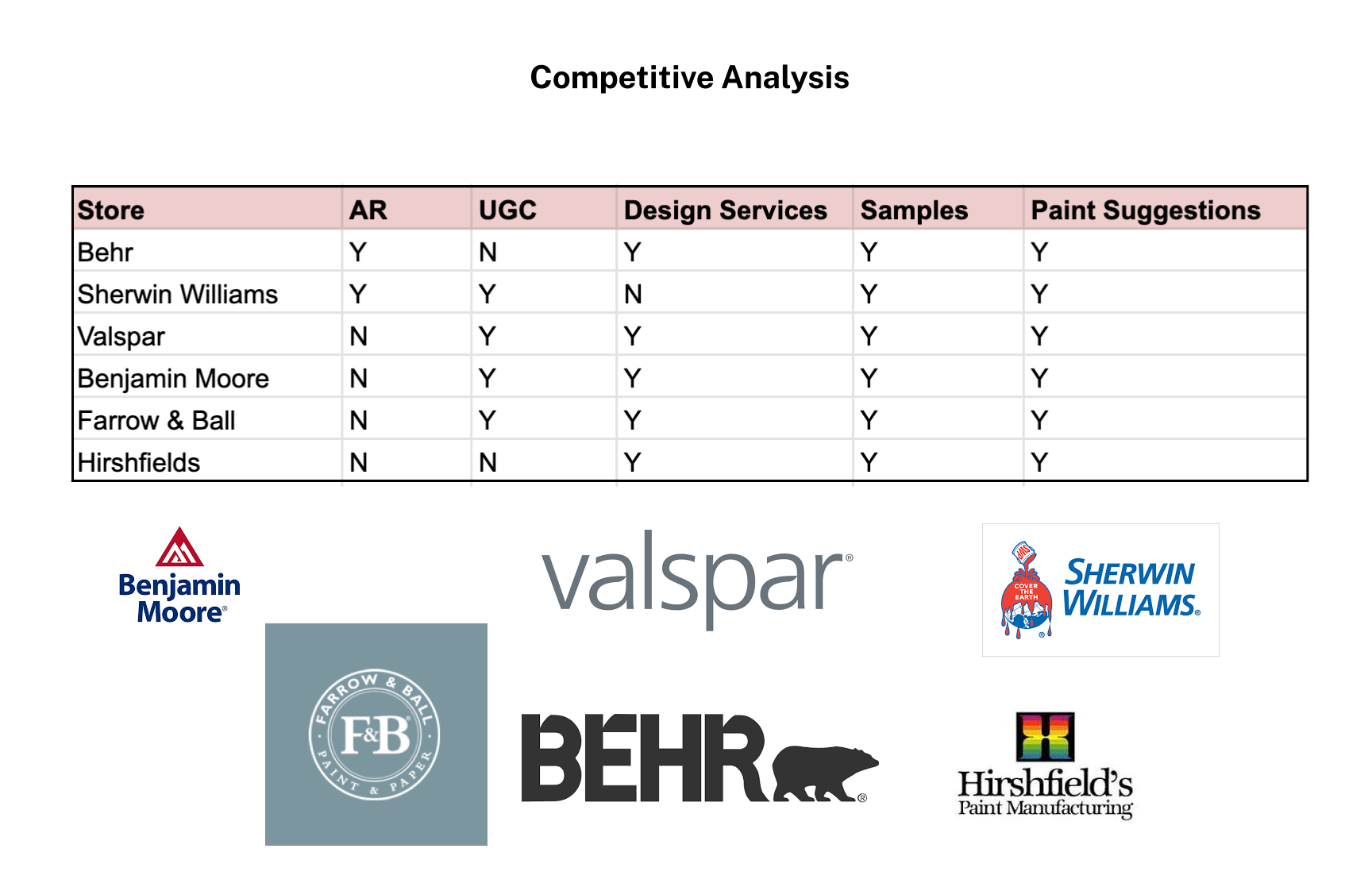
Competitive Analysis shows customer expectations
Market Trends give us a baseline. For the paint industry, this means that customers expect an easy to navigate site with a wide variety of paint colors and finishes. They appreciate customer reviews of paint colors/quality and prefer to use paint swatches or samples before putting the color up in an entire room. Paint suggestions made by professional staff or paid designers are appreciated as well as augmented reality to visualize a paint color in their room before they make a purchase.
User survey shows most customers need outside advice to choose a paint color
The majority of Clare users are between 41-50 years of age and own their homes. They have used a wide variety of paint companies; however, with the onset of the covid pandemic, many have had more trouble choosing paint colors since they are less likely to test samples in person. This highlights that now is a key time for CLARE to gain new customers through their easy to navigate mobile site, especially with the addition of an augmented reality feature which would increase customer confidence in their paint color choice.
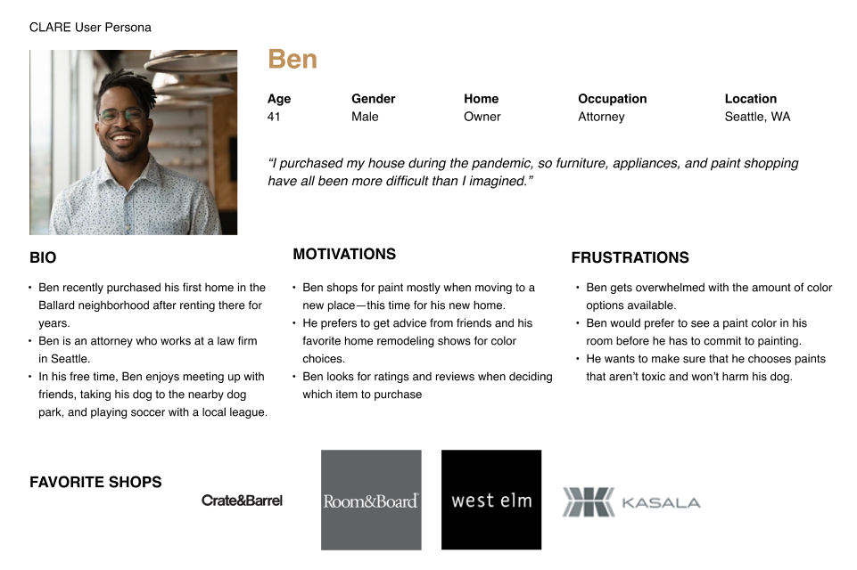
Creating a user persona based on research findings
The research I conducted showed that the CLARE user is a busy professional who owns their home and is either in the process of settling in or remodeling. They are motivated to create a relaxing environment that they can enjoy, especially since they spend more time at home post-pandemic.
2. Ideation
Mind Map
User Task Flow
Mind Map
After gathering the information on which site features users expect, I put the information together in a site structure tree. This facilitates an understanding of how all the pages and information relate to each other and will flow on the site.
User Task Flow
Based on the Mind Map, I put together a task flow to take the user from the home page to use of the AR feature on mobile.
3. Interaction Design
Wireframe Sketches
Low-Fidelity Wireframes
With market research conducted and user survey data gathered, I drew sketches focused on highlighting the information important to the user in a clean format. After several sketch iterations, I created low-fidelity wireframes based on the strongest layout.
4. Design & Branding
Style Guide
Logo, icon/wordmark, typography, color palette, and button style
High Fidelity Wireframes
Style Guide
The style guide was inspired by imagery supplied by CLARE with the aim to blend the UI work with the rest of the website. The color palette evokes a bold and energetic spirit while at the same time feeling grounded in an authoritative navy. The clean, sans serif font creates a decisive feel unencumbered by superfluous filigree.
5. User Testing and Iterations
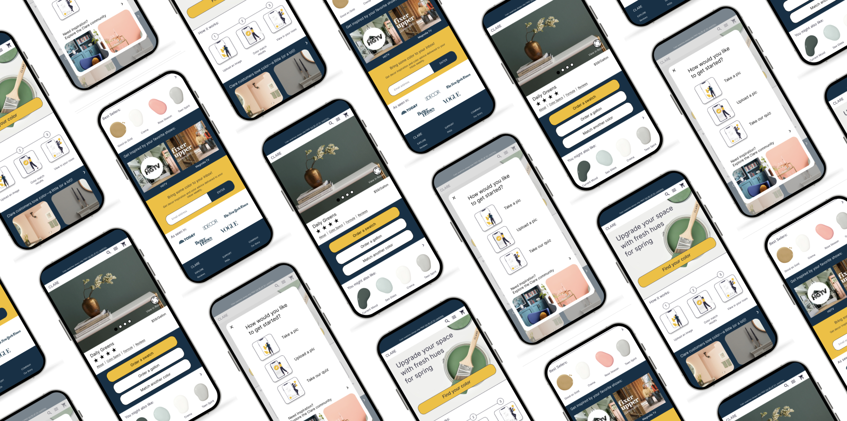
Findings from user testing showed that since customers rely heavily on their social network as well as tv and media for design advice, it would be helpful to add a section reflecting this. With that in mind, I added a “Get inspired by your favorite tv shows” block to the product detail page as you can see in version two of the frames below.
Version 1 of Product Detail Page
Version 2 of Product Detail Page


