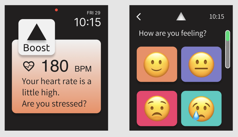
Boost—a mobile app to facilitate positive mental health in teens.

-
Client / Timeline
Boost, a smart watch app / 4 weeks
-
My Role
UX/UI Designer, Brand Designer
-
Tools Used
Figma, Whimsical, Illustrator, Typeform
-
Background
Teens are experiencing a mental health crisis. The onset of the covid pandemic increased social isolation and paralyzed social learning and peer support during a crucial time in their development. Boost seeks to help foster positive peer relationships and develop social safety nets.
-
Challenge
Provide an engaging environment that encourages teens to interact, while at the same time helping to develop positive mental health habits. The app must teach effective coping strategies while encouraging and incentivizing peers to connect with one another in a positive way.
-
Goals
Perform segment research, field expert interviews, and user research to gain an understanding of the user needs and expectations. Allow this research to inform design decisions to produce an educational and desirable product. Conduct user testing and make design iterations based on feedback.
1. Empathize
Goals
Discover which services and information need to be provided on the site.
Explore demographics of the user group.
Provide an educational experience that teaches and reinforces positive mental health habits and a social safety net.
Methodologies
Field Analysis
Field Expert Interviews
User Survey
User Persona
Findings
The targeted age group is 13-17 years old, based on the age in which we see disturbing trends emerge as well as the intersection of technological autonomy.
80% of survey responders reported that their mental health status has declined since the onset of the covid pandemic.
70% said friends and music make them feel happier.
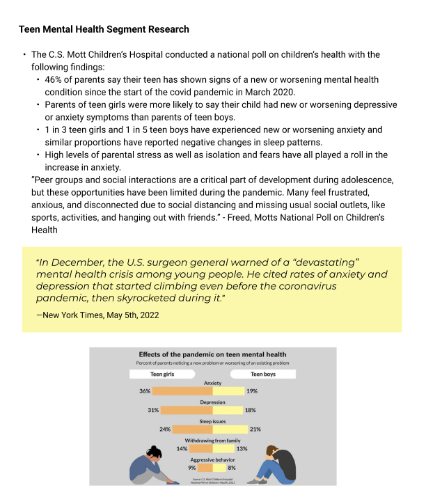
Segment Research shows teens have experienced higher rates of depression and anxiety since the onset of the covid-19 pandemic.
“In December, the U.S. surgeon general warned of a “devastating” mental health crisis among young people. He cited rates of anxiety and depression that started climbing even before the coronavirus pandemic, then skyrocketed during it.”
-New York Times, May 5th, 2022
User survey of teens 13-17 years old shows that teens find positive mental health benefits from connecting with friends and listening to music.
80% said their mental health changed for the worse since the pandemic
60% sometimes feel sad or hopeless
90% connect with friends daily via text, sports, video games
70% said talking to friends and listening to music makes them feel happier
Creating a user persona based on research findings
The research showed that the potential Boost user was a busy High School student whose life has changed significantly since the covid pandemic. Their extra-curricular activities and social life are not the same as they were, and they are still getting used to the new normal.
2. Ideation
Mind Map
User Task Flow
Mind Map
After gathering the information on what site features the user expects, I put it all together in a site structure tree. This helps to understand how all the pages and information relate to each other and will flow on the site.
User Task Flow
Based on the Mind Map, I put together a task flow to take the user from a watch notification through to sharing a song with a friend..
3. Interaction Design
Wireframe Sketches
Low-Fidelity Wireframes
With segment research conducted and user survey data gathered, I drew sketches focused on highlighting the information important to the user in a clean format. After several sketch iterations, I created low-fidelity wireframes based on the strongest layout.
4. Design & Branding
Style Guide
Logo, icon/wordmark, typography, color palette, and button style
High Fidelity Wireframes
Style Guide
Since this app is for a younger demographic, I wanted to make sure to appeal to a youthful aesthetic and so chose bold, playful colors with a clean, slightly stylized font. The logo/wordmark was chosen for its positive meaning, and the triangle logo is a portion of an arrow pointing up.
With this Style Guide as a jumping-off point, I put together high-fidelity wireframes to take the user from a Boost notification through to sending a friend a song to cheer them up.
5. User Testing and Iterations
After conducting user testing and consolidating the feedback, I made some changes to the color palette and created additional screens. Users suggested that the previous color palette with more pastel colors felt a little young, so I updated the screens to a black background with saturated colors for a more mature feel. I also added the music screen in a couple of key positions to make the user flow more realistic.
Version 1 Boost HF Wireframes
Version 2 Boost HF Wireframes


